How to Design Landing Pages That Drive Conversions

Ever poured hours into building a landing page only to hear... crickets? No clicks, no sign-ups, no sales—just digital tumbleweeds. You're not alone. Crafting a landing page that actually converts isn’t about throwing some copy and a CTA together and hoping for the best.
In this guide, we’ll break down the science (and art) of building landing pages that work. Whether you're trying to grow your email list, sell a product, or get people to download your app, we’ll walk you through the essential elements that turn curious visitors into loyal customers. No fluff, just proven tactics and smart design principles.
Ready to make every click count? Let’s dive in.
Essential Elements of a High-Converting Landing Page
If your landing page isn't converting, chances are it's missing something critical. Here’s the expanded checklist you need:
1. Write a Compelling Headline
The headline is your first impression—make it count! Keep it short, punchy, and crystal clear. Think: "Boost Your Sales by 30% in 30 Days" rather than "We Offer Good Sales Solutions." Spend extra time testing different headlines to see what resonates best with your audience. A good headline clearly identifies your visitor’s pain point and promises a solution.
2. Craft an Irresistible Value Proposition
Your visitors want to know: what's in it for them? Clearly explain how your offer solves their problem. Highlight your unique selling points and make them visible. Ensure your proposition directly answers the visitor's most important question: "Why should I care?"
3. Keep Your Copy Short and Simple
People skim—don't kid yourself. Keep your copy short and easy. No Shakespearean dramas here. Bullet points are your friends. Clearly outline benefits rather than features, and focus on readability with simple, straightforward language.
4. Use a Clear Call-to-Action (CTA)
Don’t make your visitors play hide-and-seek with your CTA. Make it bold, bright, and actionable—“Grab Your Free Guide,” not “Submit.” Experiment with different CTA texts, colors, and placements to find what maximizes clicks.
5. Optimize Page Load Speed
Slow-loading pages chase away visitors faster than broccoli chases away kids. Optimize your images, streamline your code, and pick a reliable hosting provider. Use tools like Google's PageSpeed Insights to regularly check and improve your load times.
6. Offer Exciting Incentives
Offer something juicy to sweeten the deal—like discounts, free trials, or valuable resources. Think creatively and tailor incentives specifically to your target audience's needs. The more attractive your incentive, the higher your conversion rates.
7. Simplify Your Lead Forms
Don’t interrogate your visitors. Ask only what you need—name and email usually do the trick. Longer forms tend to decrease conversions significantly. Use progressive profiling if you need more details later on.
8. Include Social Proof
Include testimonials, reviews, or logos from brands you've helped. If your mum is your only customer, maybe hold off on the testimonials for now. Real, believable testimonials with names and pictures work best. Add numbers or statistics to enhance credibility.
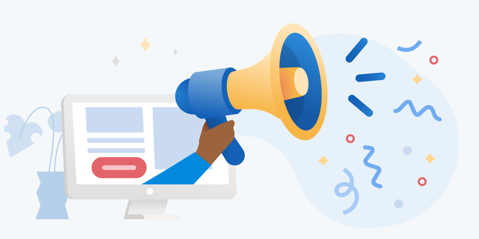
9. Choose Engaging Visual Design
Good visuals speak louder than words (sorry, copywriters). Use clear, relevant images or videos that align with your brand. Videos, especially explainer videos, can significantly increase engagement and conversions.
10. Design for User Experience
Design matters—use whitespace, highlight important points, and guide your visitors’ eyes toward your CTA. Ensure your layout is intuitive and distraction-free. And make sure it looks awesome on mobile because most visitors browse on their phones these days.
Different Types of Landing Pages
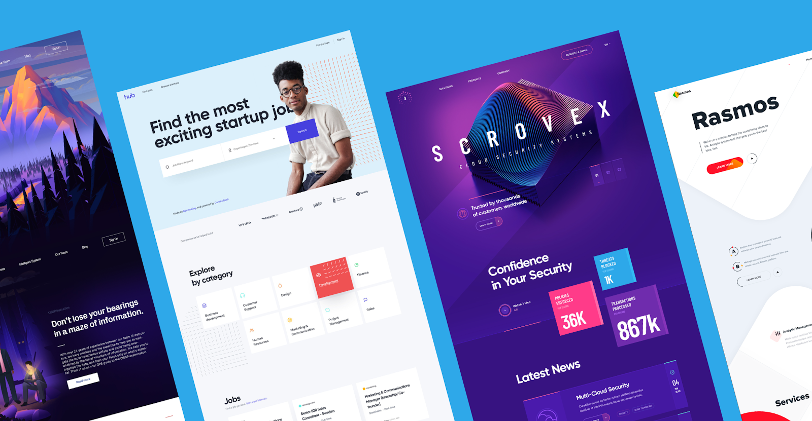
Here’s an expanded rundown:
- Click-Through Landing Pages: Short and sweet, designed to move visitors toward another page. Ideal for warming up visitors before asking for a sale.
- Lead Generation Landing Pages: Collect visitor info to nurture leads. Typically include forms offering valuable content in exchange for contact details.
- Squeeze Pages: Hyper-focused on a single offer like a discount or freebie. Keep them ultra-simple with minimal distractions.
- Sales Landing Pages: Direct and persuasive—loaded with testimonials, compelling copy, and clear product benefits. Perfect for closing deals.
- Webinar Landing Pages: Designed specifically for event registrations—highlight event value, date, speakers, and benefits clearly.
- Thank You Pages: Often overlooked but powerful for reinforcing positive experiences and suggesting next steps or related offers.
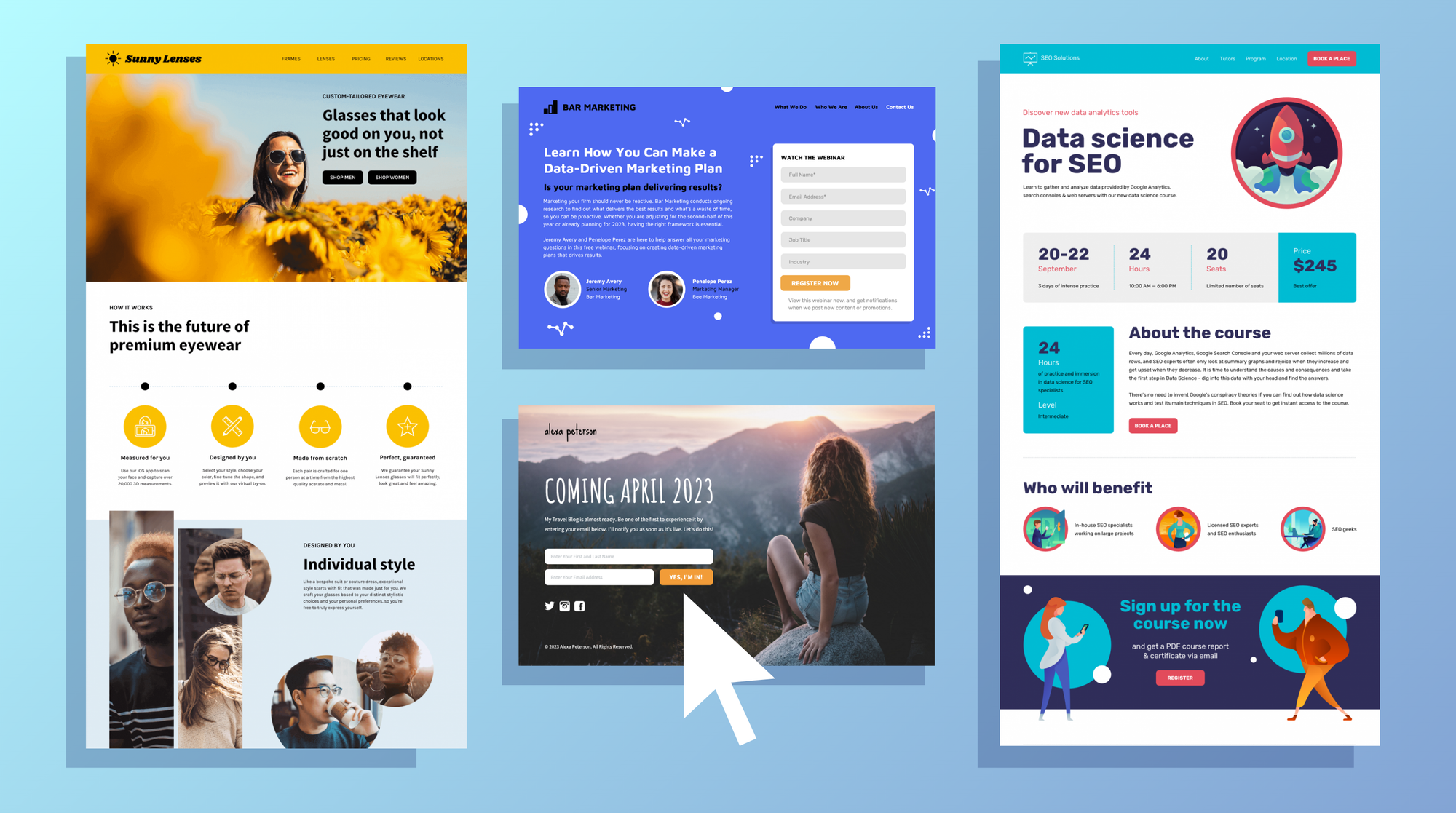
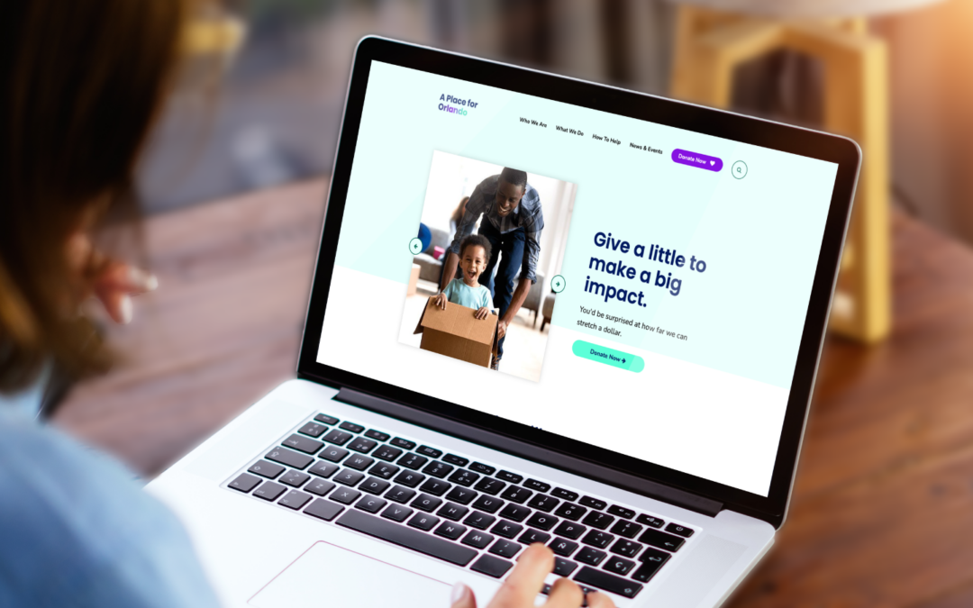
Examples of High-Converting Landing Pages
Before you start building your own, let’s break down a few landing pages that absolutely nail the conversion game—and show you why they work.
1. Leadplay
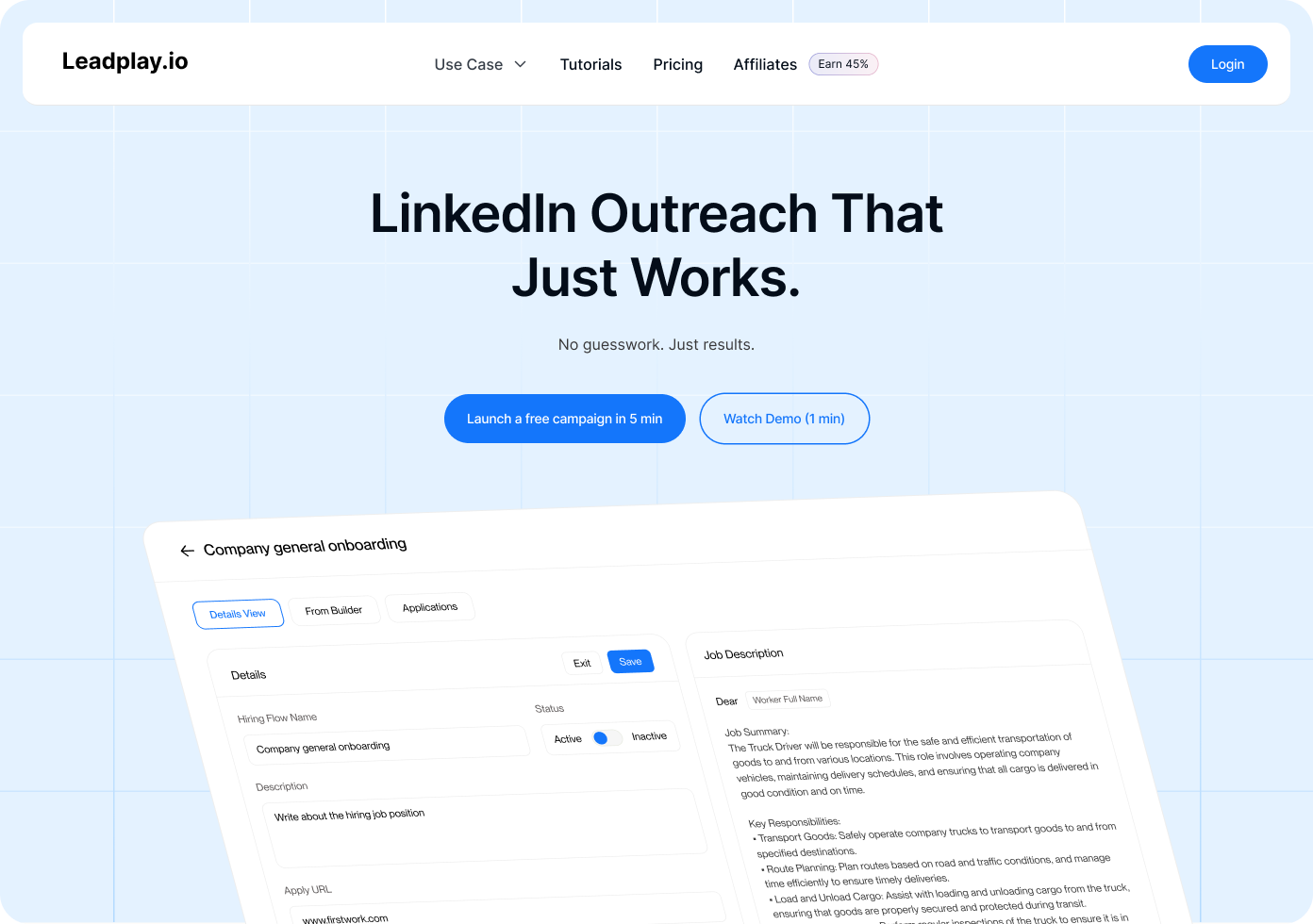
Leadplay.io nails the basics: sleek design, no-nonsense headline, and a CTA that doesn’t scream but invites—like a polite sales ninja.
Visitors are met with a short explainer video, simple layout, and benefits that are easy to scan. Think automation tools, lead prospecting, customer logos, testimonials, and a “Try Free” button that practically clicks itself.
Smart moves to copy:
- Crisp headline with real value
- Video up top = less reading, more watching
- FAQ that kills doubts before they even pop up
- Demo/free trial because we all fear commitment
2. Unbounce Landing Page
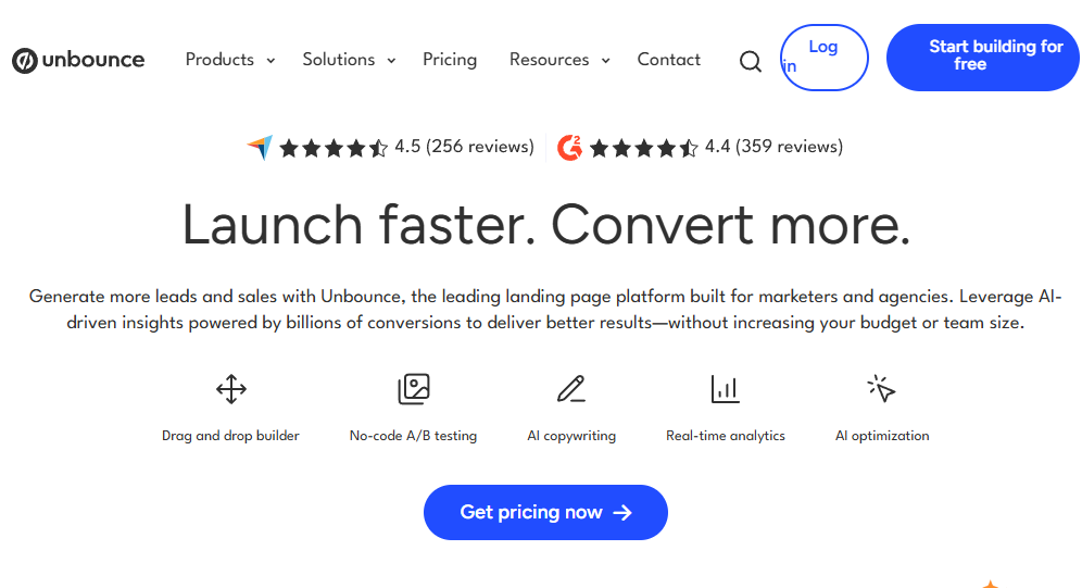
Unbounce walks the walk. Their landing page is a masterclass in clarity: bold visuals, minimalist layout, and a message that screams value. Best part? They’re always A/B testing, so every element is tuned for peak performance.
3. Dropbox Landing Page
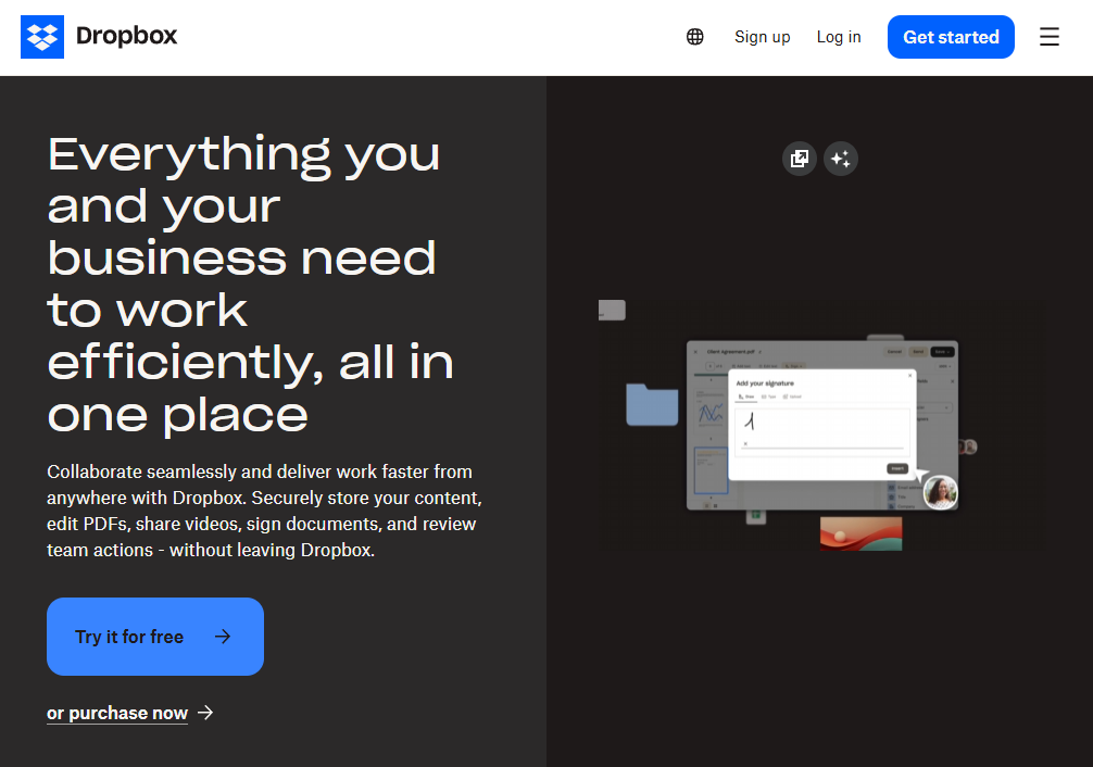
Dropbox keeps it cool with a clean, minimalistic design that gets straight to the point. Their visuals do most of the talking, the benefits are front and center, and the CTA? Unmissable. It’s effortless onboarding done right.
4. Airbnb Host Landing Page

Airbnb knows how to talk to potential hosts. Their page leads with how much you could earn (hello, motivation), offers clear next steps, and backs it all up with social proof in the form of glowing host testimonials. It’s persuasive but still feels human.
5. Crazy Egg Landing Page
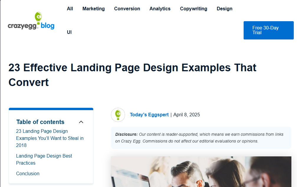
Crazy Egg’s page is built to build trust. It explains their value in plain English, showcases real user testimonials, and uses engaging visuals to guide your eyes straight to a bold, can’t-miss CTA. It’s clear, confident, and conversion-ready.
Tips for Creating Successful Landing Pages
Want your landing page to not just look good but convert like crazy? These proven tips will help you design pages that turn clicks into customers—without overwhelming your visitors.
1. Choose the Right Landing Page Builder
Don’t reinvent the wheel—tools like Unbounce, Instapage, and Leadpages make it easy to create professional, optimized landing pages with drag-and-drop ease. They also offer built-in testing and analytics to boost performance from day one.
2. Maintain Simplicity
Clutter kills conversions. Stick with a clean layout, limit distractions, and make sure every element on the page supports your one goal: conversion.
3. Test Headlines Frequently
Your headline is your first impression—make it count. Regular A/B testing helps you find which wording grabs attention and keeps visitors reading.
4. Focus on a Single CTA
One page, one purpose. A focused call-to-action eliminates confusion and guides users straight to what you want them to do—whether that’s signing up, downloading, or buying.
5. Highlight Key Points with Bullets
People scan before they read. Use bullet points to quickly spotlight your product or service’s key benefits in an easy-to-digest format.
6. Provide Clear Contact Information
Trust matters. Add a visible phone number, email, or chat option so visitors know you’re real—and reachable.
7. Display Security Badges
Ease buyer anxiety by showcasing SSL certificates, payment security seals, or trusted brand logos. It’s a small touch that builds big trust.
8. Clearly Communicate Value
Within seconds, your visitor should know exactly what they’ll get and why it matters. Make your value proposition bold, clear, and front-and-center.
9. Perform Regular A/B Testing
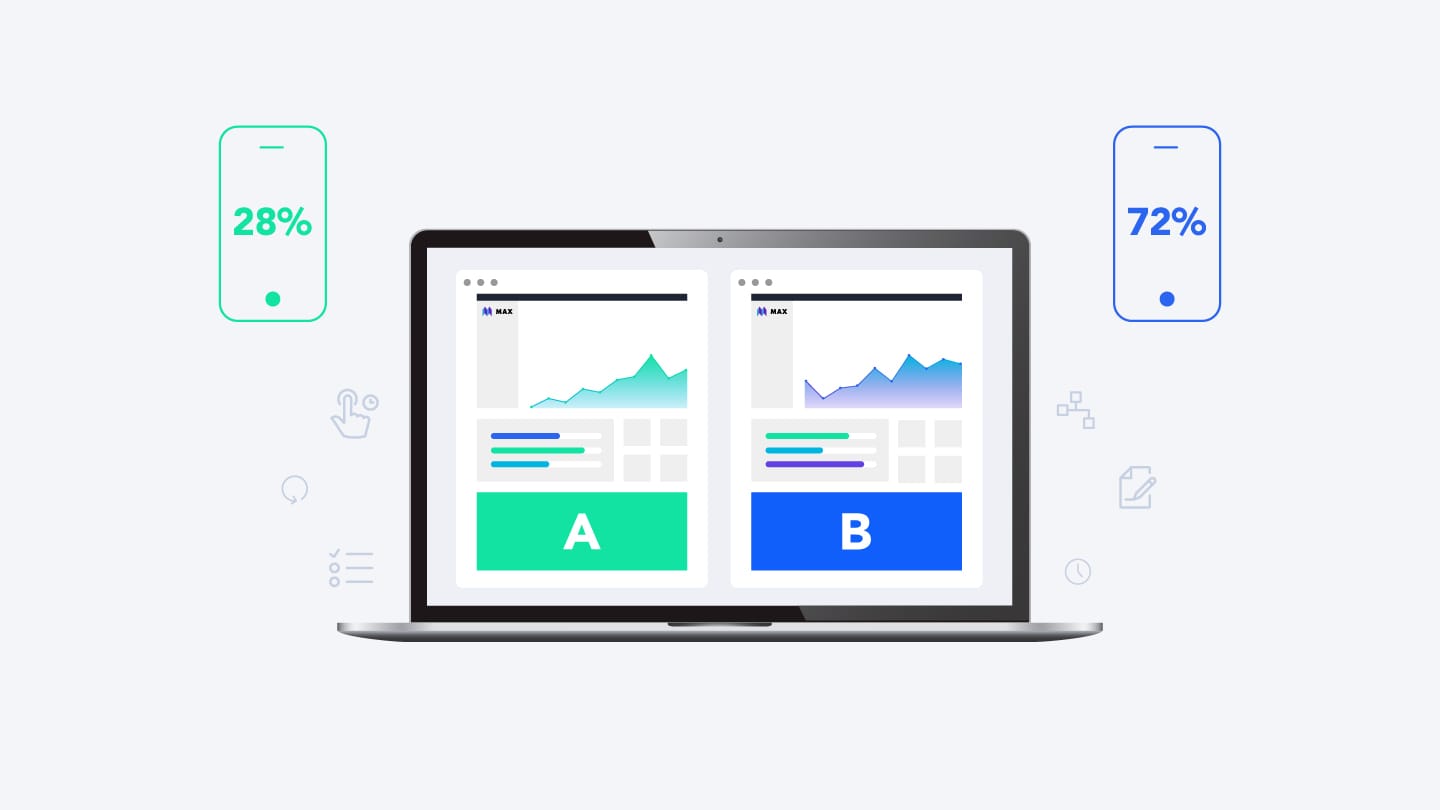
Testing isn’t optional—it’s essential. Continuously test different headlines, layouts, colors, and CTAs to fine-tune your page and maximize conversions over time.
10. Leverage Emotional Triggers
Use urgency ("Limited-time offer"), curiosity ("See how it works"), or FOMO ("Join 1,000+ happy customers") to tap into psychological drivers that boost conversions.
11. Create Effective Follow-up Pages
The journey doesn’t end after the first click. Use thank-you pages, upsell offers, or onboarding steps to keep the momentum going and guide users deeper into your funnel.
Craft Your High-Converting Landing Page
Creating a landing page that converts isn’t magic—it’s strategy. Get clear on your offer, simplify your message, and test relentlessly. If it doesn’t convert right away, keep tweaking. Soon, you'll master creating landing pages that consistently deliver results.